On the Interactive Media BSc, which is the undergraduate degree course which I attended from 2021-2023, there is an annual event run by students to showcase our work. The event is named the Interactive Media (IM) Showcase and each year a committee is formed to organise the event. The showcase committee is something I participated in every year of my enrolment on the course and is a part of my university experience which I particularly enjoyed, so I thought I would share a little bit about my time doing this, the process of organising the showcase (from a tech-team member's point of view), and about the evolution of the website.
The committee
The structure of the showcase committee hasn't changed all that much over the three years I have been on it, but the people and my role on the team has changed each year. The committee is split into five teams or divisions:
- Directors: There are two directors who make high-level decisions, contact sponsors, and coordinate the other teams.
- Marketing: Marketing do exactly as their name implies; they are in charge of making sure the showcase gets its name out there. There are many different student-run events at york so this is important to make sure we get visitors coming to the event!
- Events: The events team organise the event itsself, for instance by ordering food for the reception, coming up with the floorplan etc
- Design: Apart from the website, nearly all of the showcase graphics are created by design team. They play a big part in making the showcase look as good as it does.
- Tech: The tech team is primarily in charge of managing the website. Since the theme changes every year we have to redesign it, as well as update it and manage hosting and project submissions.
Note about archives
The current website will always be available at https://imshowcase.co.uk/ but we have live archives of every showcase website since 2019. I have configured these to be accessible via subdomains. A list of the available archives to date is as follows:
- https://2019.imshowcase.co.uk/
- https://2020.imshowcase.co.uk/
- https://2021.imshowcase.co.uk/
- https://2022.imshowcase.co.uk/
- (new!) https://2023.imshowcase.co.uk/
Showcase 2021
The first year I participated in the showcase was 2021, which was also my first year of being at university. In 2021 there was still a lot of uncertainty surrounding coronavirus so although we had been hoping it would be in-person it had to be moved online. Because the visitors would not be able to visit and use the projects in-person, the website had extra importance this year, and there were many features which had not been present in previous sites.
My role on the committee at the time was deputy-lead of the tech team. Deputy leads support their Team lead in making decisions and chairing meatings. Anyone on the course is welcome on the showcase committee regardless of yeargroup or prior experience, which makes it a very valuable way to learn new skills or try something new. While there is a web-development module on the course, many of the modules on the course are designed to give you a feel for what they teach so that if you want to learn more you can explore further on your own. Although I had spent a lot of time teaching myself web-development prior to the course, I had absolutely no experience working in a team. As a result of this, I suggested technology I was familiar with, but not always so familiar to my teammates. Luckily they took this in their stride.
One such suggestion was that we use a headless CMS named Storyblok to edit the website. Storyblok provides a visual editor allowing you to define custom components called "bloks", and the data for which can be used to generate a website by feeding it into a static-site generator. Despite being an excellent CMS and also having a fairly generous free plan, for relatively small websites such as that of the IM Showcase, it could be considered overkill. My reason for suggesting that we use this, apart from wanting to try out a cool new toy in a production site, was that it might allow other teams such as marketing or the showcase directors to update the website themselves. Unfortunately this is not what ended up happening so the only result was that I had overcomplicated development of the site and given myself and my teammates (who had not used it before) extra work.
As mentioned earlier, due to the heightened importance of the website this year, project submissions operated differently and extra features needed to be added. For one thing, we wanted to accept submission of project files so that people could view the projects at home. I also added a comment system to allow people to post public comments on projects.
The submission form and comments functionality both utilised netlify serverless functions, which added the submission data and comments to Storyblok via their Management API. This is objectively a dreadful way to make a comment system and even at the time I knew I should have been using a seperate database, it was free. I won't defend my actions. 😳
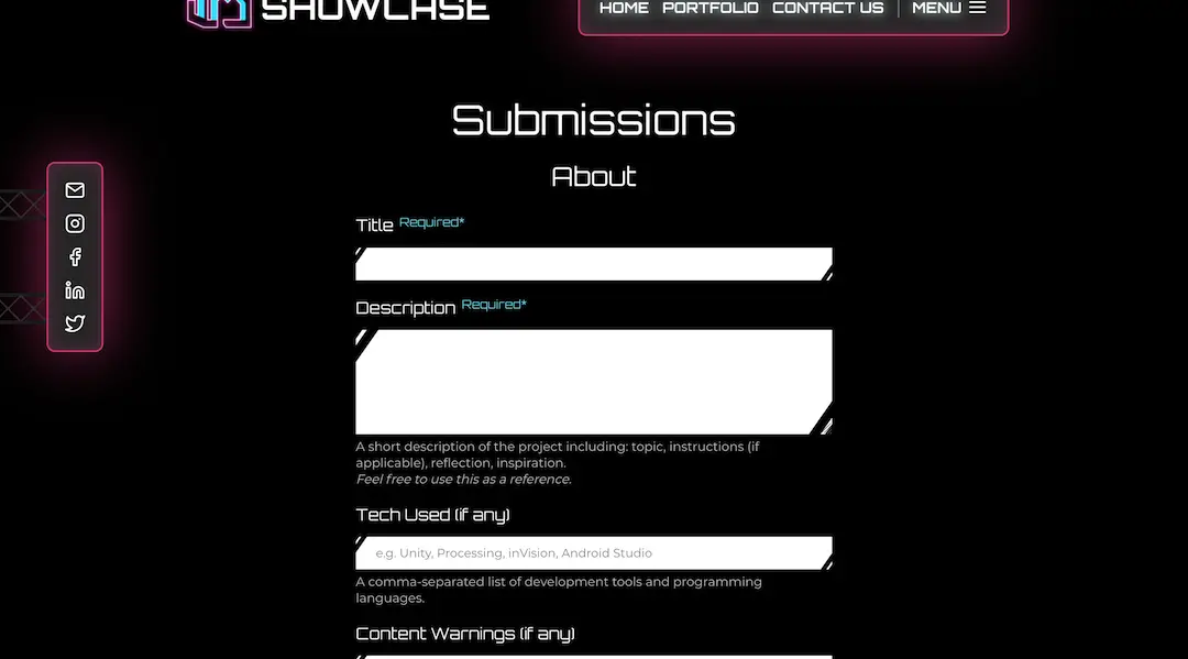
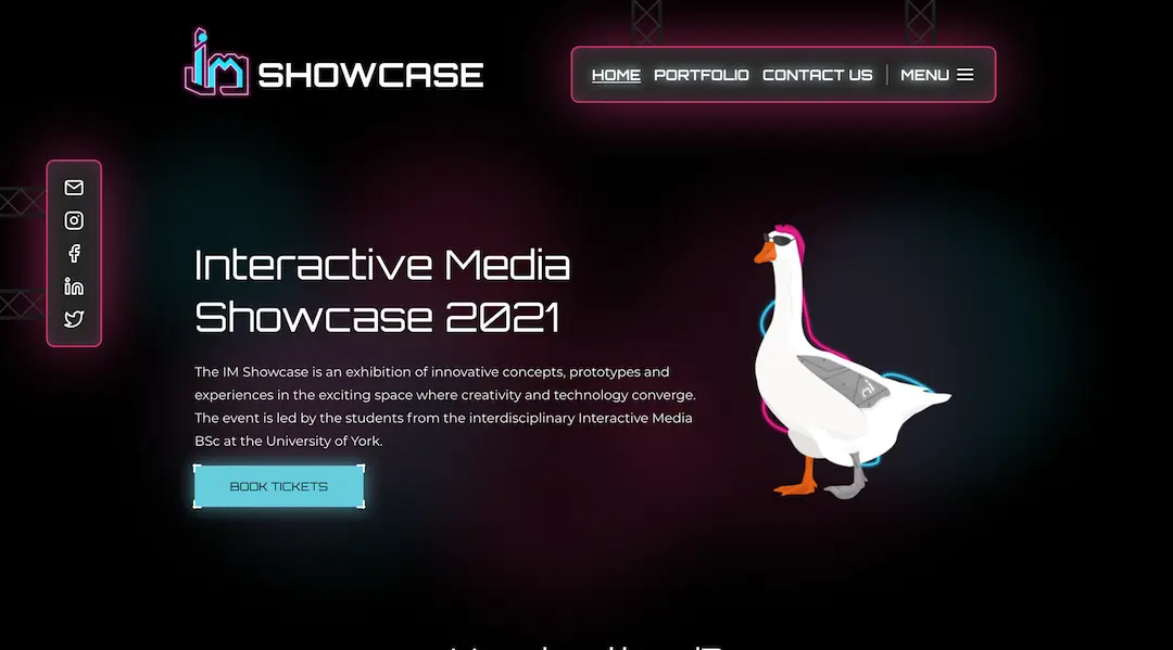
The theme for 2021's IM Showcase was "Cyberpunk" which made designing the website a very fun challenge. Before the showcase we even had a live Nixie-style coundown in the spot now occupied by the year's cyborg goose mascot: Cyberboi! We also used a hefty amount of box-shadow to give a cool neon effect to the navbar and buttons etc.
Showcase 2022
In the second year I participated in the showcase there was a much lower number of people wanting to join the tech team. To be precise, me and a friend were the only members. I decided that since we already had all of the projects from past-projects stored in storyblok, it would make sense that we should just keep using storyblok and simply redevelop the site with the new theme.
Although this made some amount of sense, in doing so I repeated my mistake from 2021 by failing to account for my teammates skillsets. While my teammate had experience in backend web-development, their experience with frontend Javascript libraries such as Vue, static site generators (SSG) such as Nuxt, and Storyblok, was very limited. As a result it was too much work for them to learn all this while focusing on assessments, so all of the work fell to me.
Luckily, the 2022 showcase was in-person! This meant that we did not need to take submission of project files like in 2021 or add comments to projects (although that would have been a nice feature). To make things easier, submissions this year were done via a google form as I didn't have the time to develop a custom one like the year before. The theme for 2022 was "space", and although I was not quite sure at first how I should translate that into a website design, with some suggestions from the directors and the rest of the committee we ended up using a frosted glass look for components such as the navbar. I am overall quite happy with how it turned out.
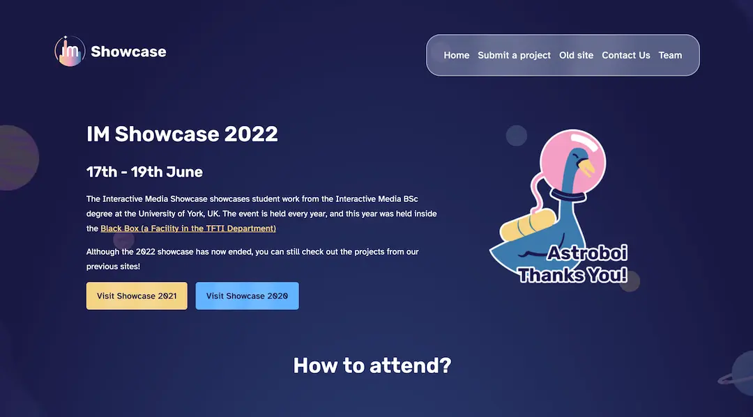
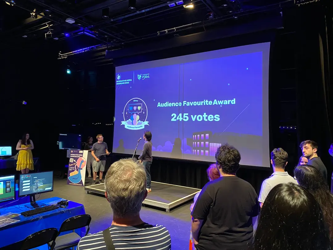
The actual physical event was also a big success! We had more projects submitted than previous showcases and had a very healthy number of visitors show up as well.
Showcase 2023
My third and final year on the showcase! This years theme was hacking, and yet again the design team did a great job on the branding. Now being in third year I stepped down from being lead or deputy-lead in 2023 to allow more time to work on my final-year assessments (although I still couldn't help myself from taking on a significant number of showcase tasks!). I was very relieved however that this time I had plenty of team members to help spread the workload. This year, as in 2021, members took on certain types of tasks within the team, two of us focused on the design and the rest on development, with everyone weighing in on design decisions from time to time.
We put quite a lot of effort into the website's design, and spent a long time finding the right the pixel-style font (we used Pixeloid in the end). The 2023 design team also came out with some cool graphics such as a spinning wireframe duck model which we put in pride of place at its traditional position at the top of the homepage. Edmund Wei, who was a director in 2022 but joined the tech team for 2023 even embedded an interactive 3d model made by design into the top of the projects and past-projects pages using three.js.
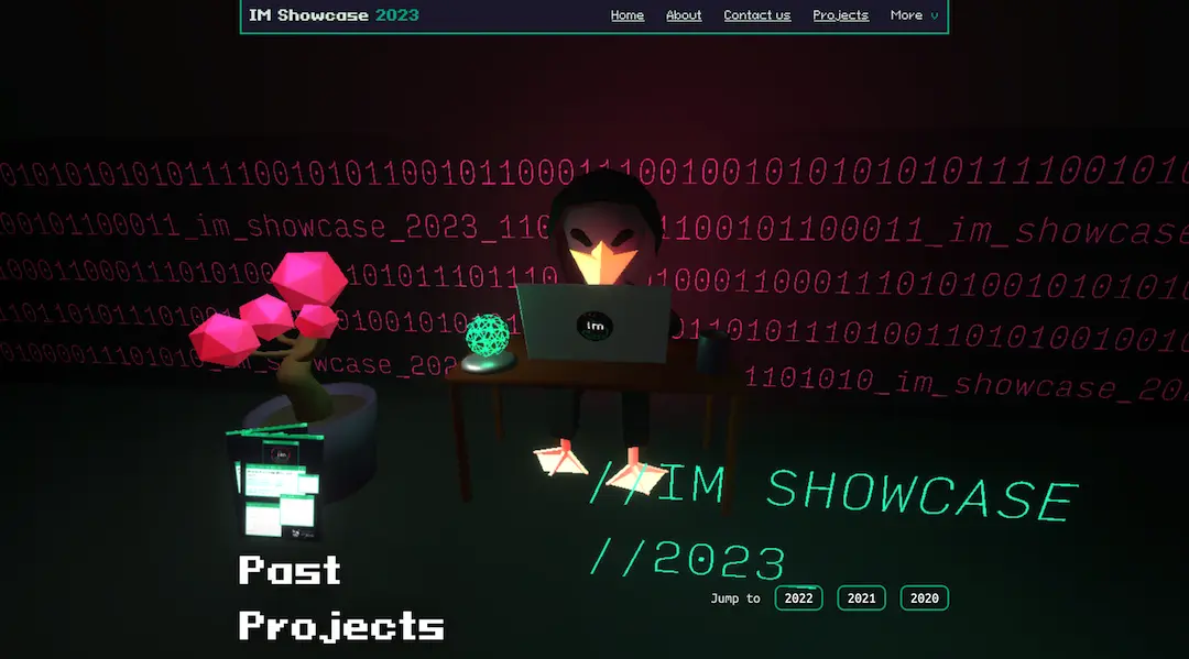
Although I wasn't a lead this time, my knowledge of how the showcase websites have been hosted and managed meant that I was also in charge of deploying the site to Netlify, and updating the domain, alongside my regular development tasks. This time however, when it came to tools and architecture we made a significant departure from the previous two years. In an attempt to simplify the codebase we stopped hosting our data in Storyblok, which we hadn't been taking full advantage of anyway, and hosted the data locally in json files. We also switched from using NuxtJS to Astro. Astro is a relatively new site-generator, but doesn't tie you to a Javascript Library such as Vue or React, and claims to be far more performant to other more well-known tools.
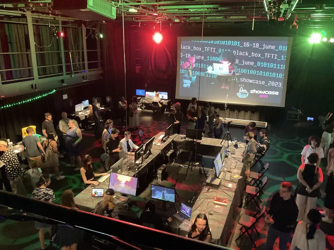
Along with the design of the website, the in-person event also looked the part. As usual it was hosted in the department's black box facility, which is fitted with lots of lighting and sound equipment and a staff member graciously configured some projections and lighting to fit the theme.
Thank you for reading this far, as you might be able to tell, the showcase has been a pretty important part of my time at university. If you are interested in Games, Websites, Essays about technology and Interactive Media, I would recommend visiting. You can check the showcase website or social media for details of dates and location. It means a lot for us students to be able to show off our work and make connections.